On this page
| Table of Contents |
|---|
...
Overview
Depending on how you configure it, this gadget can calculate the key Kanban metrics like "Cycle Time" or "Lead Time" for the issues from a specified filter and for a certain time interval and display their distribution as a histogram. Optionally, the average cycle time can be displayed as a separate line and a custom threshold line can be added for easily identifying the issues that had an abnormally long cycle time.
...
See the settings description below for how to configure the gadget.
| Tip |
|---|
Tips & Tricks
To calculate "Lead Time", set the following:
|
Configuration
The settings of this gadget are divided in 2 3 tabs:
Data tab - contains the required settings of the gadget, such as title or data source
More Settings tab - contains the optional settings, such as card colors
Colors tab
Data tab
On this tab you can configure the required settings of the gadget.
...
Setting | Description |
|---|---|
Gadget Title | Choose what to display in the title bar of the gadget. |
Data Source | Choose the board or the Jira issue Select the type of Data Source used by the gadget:
|
Split range criteria | Choose how to define the segmented columns (bins). If you choose Attempt to split in ? equal intervals, the gadget will try to divide the range in equal intervals, although it is not always possible to split in the number of intervals that you specified. So the number that you enter is actually a "desired" number. If you choose Split by using these custom thresholds, the range will be divided according to the entered thresholds. In this case, you must manually introduce the thresholds separated by a comma (for example: 100, 200, 300, 400, 500). |
Cycle starts | Indicates what to consider as the start event of a cycle. You can choose between:
Choose also how to handle the case when there are multiple transitions to the start status or to the status category by setting If multiple entries in the start status, consider the ? entry to first or last. See the example below. Example If you set If multiple entries in the start status, consider the first entry, the cycle will start when the issue was transitioned to the "In Progress" status for the first time. If you set If multiple entries in the start status, consider the last entry, the cycle will start when the issue was transitioned to the "In Progress" status for the last time. |
Cycle ends | Indicates what to consider as the end event of a cycle. You can choose between:
You can also choose how to handle the case when there are multiple transitions to the end status by setting If multiple entries in the end status, consider the ? entry to first or last. See the example below. Example If you set If multiple entries in the end status, consider the first entry, the cycle will end when the issue was transitioned in the "Done" status for the first time. If you set If multiple entries in the end status, consider the last entry, the cycle will end when the issue was transitioned in the "Done" status for the last time. |
Multiple cycles | Decide how the gadget should handle those Jira issues that have multiple cycles. This situation occurs if the issue was transitioned multiple times through the start and the finish statuses of the cycle. Example You can choose between:
|
Time interval: | Specify the time interval for which to display data. You can specify a fixed time interval or a number of days back relative to the current date, with the current day being included. |
...
Setting | Description |
|---|---|
Calculate the cycle time in | Specify in what time unit measure the cycle time will be calculated and displayed. |
Don't count weekends | Check this option if you want to exclude the weekends (Saturdays and Sundays) from the cycle time calculation. |
Display average line | Check this option if you want the chart to display a vertical line with the average cycle time for the specified time interval. |
Display threshold line | Check this option if you want the chart to display a vertical line representing a threshold. The issues that have a cycle time higher than the specified Threshold value will be colored in red. |
Display percentile lines | Check this option and enter the values (percents) corresponding to the percentiles to be displayed as vertical lines. A percentile is a value from the data set that splits the data into two pieces: the lower piece contains the percent of the data, and the upper piece contains the rest of the data. For example, the 75% percentile will be displayed as a horizontal line with 75% of the issues under it and the rest of the issues (25%) over it. |
Show legend | Check this option if you want the chart legend to be displayed. |
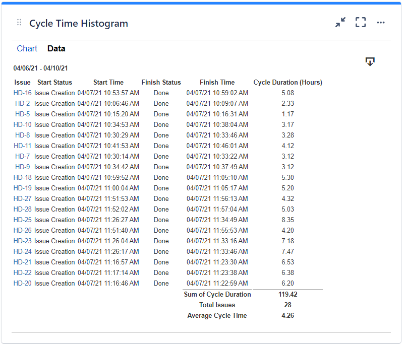
Show data table | Check this option if you want a data table to be displayed along with the chart. The Data tab displays the issues along with their cycle time details and the average calculation. |
Colors tab
...
Setting | Description |
|---|---|
Automatically assign colors | Check this if you want the chart to automatically assign colors for the series. |
Custom colors | Select any custom color you want the series to be displayed on by either entering the color's hexadecimal code or picking a color. You can also use the Copy and Import buttons to copy and import the color configuration to gadgets of the same type. |
Related blog articles
The following blog articles provide more information on how to use this gadget.


