...
Setting | Description |
|---|---|
Calculate in | Specify in what time unit measure the results will be displayed. |
Don't count weekends | Check this option if you want to exclude the weekends (Saturdays and Sundays) from the cycle time calculation. |
Display average line | Check this option if you want the chart to display a line with the average cycle time for the specified time interval. |
Display rolling average line and standard deviation | Check this option if you want the chart to display the rolling average line, which allows visualizing the trend, along with the standard deviation that allows identifying the outliers. You must also specify the odd number of X issues representing the window used for calculating the rolling average and the standard deviation. The rolling average and standard deviation are issue-based, not time-based. For every issue shown on the chart, the rolling average and the standard deviation (at that point in time) are calculated by taking the issue itself, X/2 issues before the issue and X/2 issues after the issue, then averaging their cycle times. For example, if you choose to calculate based on a 15-issues window, the calculation will be based on the issue itself, with 7 issues to the left and 7 issues to the right. |
Display threshold line | Check this option if you want the chart to display a line representing a threshold. The issues that have a cycle time higher than the specified Threshold value will be colored in red. |
Display percentile lines | Check this option and enter the values (percents) corresponding to the percentiles to be displayed. A percentile is a value from the data set that splits the data into two pieces: the lower piece contains the percent of the data, and the upper piece contains the rest of the data. For example, the 75% percentile will be displayed as a horizontal line with 75% of the issues under it and the rest of the issues (25%) over it. |
Use logarithmic scale for the vertical axis | Check this option if you want the chart to display a logarithmic scale instead of a linear scale for the Y axis. |
Show legend | Check this option if you want the chart legend to be displayed. |
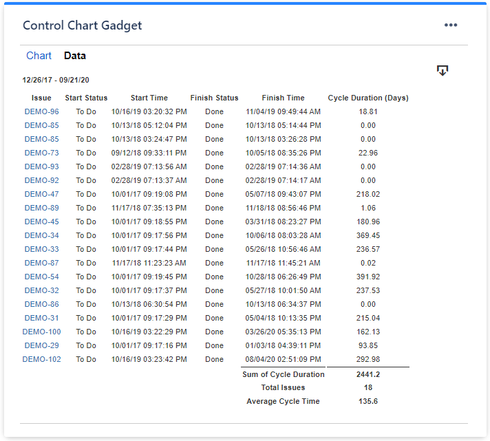
Show data table | Check this option if you want a data table to be displayed along with the chart. The Data tab displays the issues along with their cycle time details and the average calculation. |
Colors tab
...
Setting | Description |
|---|---|
Automatically assign colors | Check this if you want the chart to automatically assign colors for the series. |
Custom colors | Select any custom color you want the series to be displayed on by either entering the color's hexadecimal code or picking a color. You can also use the Copy and Import buttons to copy and import the color configuration to gadgets of the same type. |
Related blog articles
The following blog articles provide more information on how to use this gadget.
...
