...
Setting | Description |
|---|---|
Calculate the cycle time in | Specify in what time unit measure the cycle time will be calculated and displayed. |
Don't count weekends | Check this option if you want to exclude the weekends (Saturdays and Sundays) from the cycle time calculation. |
Display average line | Check this option if you want the chart to display a vertical line with the average cycle time for the specified time interval. |
Display threshold line | Check this option if you want the chart to display a vertical line representing a threshold. The issues that have a cycle time higher than the specified Threshold value will be colored in red. |
Display percentile lines | Check this option and enter the values (percents) corresponding to the percentiles to be displayed as vertical lines. A percentile is a value from the data set that splits the data into two pieces: the lower piece contains the percent of the data, and the upper piece contains the rest of the data. For example, the 75% percentile will be displayed as a horizontal line with 75% of the issues under it and the rest of the issues (25%) over it. |
Show legend | Check this option if you want the chart legend to be displayed. |
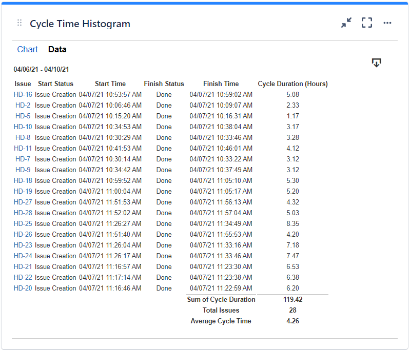
Show data table | Check this option if you want a data table to be displayed along with the chart. The Data tab displays the issues along with their cycle time details and the average calculation. |
Colors tab
...
Setting | Description |
|---|---|
Automatically assign colors | Check this if you want the chart to automatically assign colors for the series. |
Custom colors | Select any custom color you want the series to be displayed on by either entering the color's hexadecimal code or picking a color. You can also use the Copy and Import buttons to copy and import the color configuration to gadgets of the same type. |
Related blog articles
The following blog articles provide more information on how to use this gadget.
...
