...
Setting | Description |
|---|---|
Calculate in | Specify in what time unit measure the results will be displayed. |
Series to Display | Choose what series to display in the chart. You can select one or more options:
|
Don't count weekends | Check this option if you want to exclude the weekends (Saturdays and Sundays) from the cycle time calculation. |
Show the Overall Average Cycle Time, calculated as the average of the last ? intervals | Check this option and specify a number of intervals, if you want the chart to calculate and display the overall average. |
Show legend | Check this option if you want the chart legend to be displayed. |
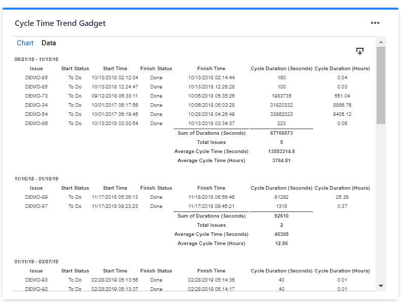
Show data table | Check this option if you want a data table to be displayed along with the chart. The Data tab displays, for every time interval in the chart, the issues along with their cycle time details and the average calculation. |
Display horizontal gridlines | Check this option if you want the chart to display gridlines for the vertical axis. |
Refresh cached data at next display | This gadget uses data caching for faster display, which means that some data resulted after processing are saved and reused next time the gadget is loaded. If you check it, the cache of the gadget will be deleted and recreated at the next reload. This setting is not persistent.
|
...
