...
On this tab you can configure the required settings of the gadget.
...
Setting | Description |
|---|---|
Gadget Title | Choose what to display in the title bar of the gadget. |
Data | Choose the board or the Jira issue filter containing the issues for which you want the metrics to be calculated. Make sure that the specified filter is shared with the users who will also visualize this gadget. Check Include the sub-tasks if you want the sub-tasks from the selected board or filter to be included in the calculation. |
Cycle starts | Indicates what to consider as the start event of a cycle. You can choose between:
Choose also how to handle the case when there are multiple transitions to the start status or to the status category by setting If multiple entries in the start status, consider the ? entry to first or last. See the example below. Example If you set If multiple entries in the start status, consider the first entry, the cycle will start when the issue was transitioned in the "In Progress" status for the first time. If you set If multiple entries in the start status, consider the last entry, the cycle will start when the issue was transitioned in the "In Progress" status for the last time. |
Cycle ends | Indicates what to consider as the end event of a cycle. You can choose between:
You can also choose how to handle the case when there are multiple transitions to the end status by setting If multiple entries in the end status, consider the ? entry to first or last. See the example below. Example
If you set If multiple entries in the end status, consider the first entry, the cycle will end when the issue was transitioned to the "Done" status for the first time. If you set If multiple entries in the end status, consider the last entry, the cycle will end when the issue was transitioned to the "Done" status for the last time. |
Multiple cycles | Decide how the gadget should handle those Jira issues that have multiple cycles. This situation occurs if the issue was transitioned multiple times through the start and the finish statuses of the cycle. Example You can choose between:
|
Time interval | Specify the time interval for which to display data. You can specify a fixed time interval or a number of days back relative to the current date, with the current day being included. |
...
On this tab you can configure the optional settings of the gadget.
...
Setting | Description |
|---|---|
Calculate in | Specify in what time unit measure the results will be displayed. |
Don't count weekends | Check this option if you want to exclude the weekends (Saturdays and Sundays) from the cycle time calculation. |
Display average line | Check this option if you want the chart to display a line with the average cycle time for the specified time interval. |
Display rolling average line and standard deviation | Check this option if you want the chart to display the rolling average line, which allows visualizing the trend, along with the standard deviation that allows identifying the outliers. You must also specify the odd number of X issues representing the window used for calculating the rolling average and the standard deviation. The rolling average and standard deviation are issue-based, not time-based. For every issue shown on the chart, the rolling average and the standard deviation (at that point in time) are calculated by taking the issue itself, X/2 issues before the issue and X/2 issues after the issue, then averaging their cycle times. For example, if you choose to calculate based on a 15-issues window, the calculation will be based on the issue itself, with 7 issues to the left and 7 issues to the right. |
Display threshold line | Check this option if you want the chart to display a line representing a threshold. The issues that have a cycle time higher than the specified Threshold value will be colored in red. |
Display percentile lines | Check this option and enter the values (percents) corresponding to the percentiles to be displayed. A percentile is a value from the data set that splits the data into two pieces: the lower piece contains the percent of the data, and the upper piece contains the rest of the data. For example, the 75% percentile will be displayed as a horizontal line with 75% of the issues under it and the rest of the issues (25%) over it. |
Use logarithmic scale for the vertical axis | Check this option if you want the chart to display a logarithmic scale instead of a linear scale for the Y axis. |
Show legend | Check this option if you want the chart legend to be displayed. |
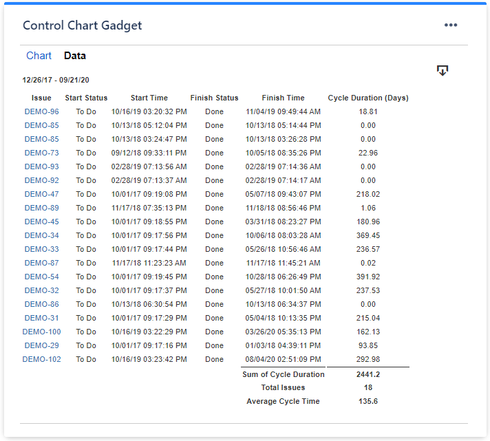
Show data table | Check this option if you want a data table to be displayed along with the chart. The Data tab displays the issues along with their cycle time details and the average calculation. |
...


